




The Evolution of the B! — Method to the Madness
Every recognizable brand begins with an idea. For !Booyah! (BOO!), that idea gradually became a symbol: the bold B!
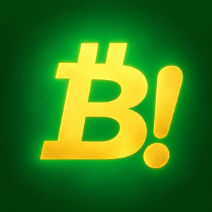
The logo was developed to be simple enough to recognize instantly, yet distinctive enough to carry the personality of the !Booyah! community. Through multiple concepts, colors, materials, and digital interpretations, the design evolved toward a cleaner identity built around two essential elements: B + !
And importantly, the modern design stands on its own without the two bars underneath the B.
From an Idea to a Symbol
The earliest !Booyah! concepts explored a stylized B influenced by the visual language of cryptocurrency and digital culture. As the identity developed, the design became less complicated.
Instead of filling the mark with unnecessary elements, the focus shifted toward the shape itself.
The B became larger, stronger, and easier to recognize. The exclamation mark became an equally important part of the identity.
Together they formed:
B!
A compact visual expression of the name Booyah!
Why the Exclamation Mark Matters
“Booyah!” isn’t a quiet word. It expresses excitement, celebration, confidence, and momentum.
That is why the ! is not simply punctuation added beside the B. Within the brand story, it represents the energy behind the name.
B = Booyah.
! = Energy, action and celebration.
The round point beneath the exclamation mark also gives the symbol visual balance, helping the B! function as one unified mark.
The Gold Identity
Gold became one of the defining visual elements of !Booyah!
Historically, gold has been associated with value, achievement, durability and ambition. In the !Booyah! identity, it is used as a design language rather than a promise of financial value.
Against deep black, the gold B! becomes especially recognizable. The contrast creates a premium digital appearance while allowing the silhouette of the logo to remain clear even at smaller sizes.
Gold represents ambition. Black represents strength and contrast. Together, they create the signature !Booyah! look.
The Evolution of the !Booyah! Logo
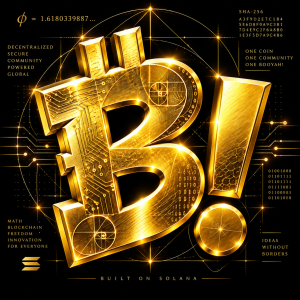
The logo did not arrive at its current appearance in a single step. Different versions explored dimensional lettering, polished metallic surfaces, black-and-gold combinations, circular coin designs, blockchain-inspired circuitry, and simplified standalone marks.
Each experiment helped answer an important question:
What does the logo actually need?
Over time, the answer became simpler.
It needed the B.
It needed the !
It did not need the two bars underneath.
Removing those bars produces a cleaner silhouette and gives the B! more independence from visual conventions associated with other cryptocurrency symbols.
That simplicity is part of the evolution.
Method to the Madness
At first glance, B! may appear extremely simple. That simplicity is intentional.
A strong symbol should work on a tiny wallet icon and still remain recognizable when enlarged onto a website, clothing design, digital coin, billboard or community advertisement.
The modern B! therefore focuses on proportion, negative space, visual balance and a strong silhouette. The two openings inside the B create recognizable internal geometry, while the exclamation mark provides a vertical counterweight to the larger letterform.
The goal isn’t complexity for complexity’s sake.
The goal is recognition.
From Logo to Digital Identity
As !Booyah! developed on Solana, the B! symbol also began appearing inside more elaborate digital-coin designs incorporating circuit patterns, network imagery and technological geometry.
Those elements can represent the broader blockchain environment surrounding the project, while the central B! remains the recognizable identity.
This distinction matters: the circuitry, mathematical graphics and coin engravings can change from one artwork to another.
The B! stays.
That allows the brand to have both a simple primary logo and highly detailed artistic interpretations without losing its core identity.
A Symbol Built Around Community
Ultimately, the !Booyah! logo is intended to represent more than a cryptocurrency ticker.
Within the project’s brand story, it represents people connecting, creating, participating and building something together.
That idea can be summarized in the message that has accompanied the project throughout its evolution:
ONE COIN. ONE COMMUNITY. ONE BOOYAH!
From the first experimental B to the polished gold B!, the identity has continued to become simpler, stronger and more recognizable.
No unnecessary bars.
No unnecessary complexity.
Just B!
!Booyah! Boo! — Ideas Without Borders.